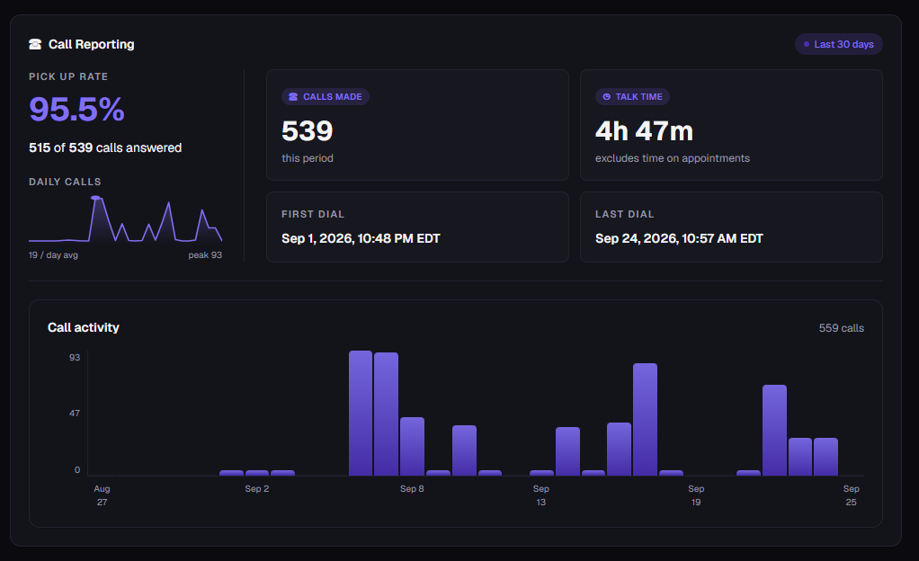

The dashboard is showing call data from the most recent 30-day period.
This metric helps show how consistently calls are being picked up. A higher percentage means fewer incoming calls are going unanswered.
In this example:
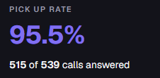
This represents the percentage of incoming calls that were answered.
515 of 539 calls answered
539 total calls
515 answered
Approximately 24 calls were not answered
The resulting pickup/answer rate is 95.5%
The Daily Calls mini-chart shows how call volume changed from day to day during the reporting period. Spikes indicate days with significantly more calls, while lower points indicate quieter days.
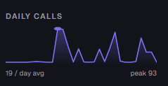
Information shown above:
19 / day avg — Average of about 19 calls per day.
Peak 93 — The busiest day had 93 calls.
The line graph shows fluctuations in call volume throughout the period.
This is the overall call volume. It provides a quick measure of how many calls occurred during the selected period.
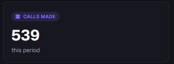
This card shows the total number of calls recorded for the reporting period.
“this period” indicates that the number applies to the selected 30-day reporting window.
This measures actual conversation time rather than simply counting calls. It can help show how much time was spent communicating with callers during the reporting period.

This represents the total amount of time spent actively talking on calls.
The dashboard specifically notes: excludes time on appointments
It establishes when call activity began within the current reporting window.

This indicates the earliest call recorded in the displayed reporting period.
It shows the latest point at which call activity was recorded.
Together, First Dial and Last Dial provide the beginning and ending timestamps of the call activity represented in the report.

Sep 24, 2026, 10:57 AM EDT
This indicates the most recent call recorded in the report.
This is the larger chart at the bottom of the section. This chart is useful for identifying patterns in call volume, such as:
Busy days
Low-activity days
Sudden increases in calls
Periods with little or no call activity
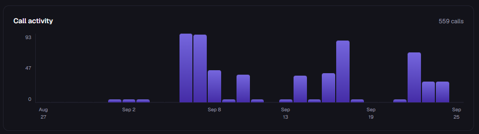
The chart provides a visual representation of call volume over time.
X-axis: Dates
Y-axis: Number of calls
Each vertical bar represents call activity for a particular day.
Taller bars represent days with more calls.
Shorter bars represent days with fewer calls.
For example, the chart shows several noticeable spikes around September 6–8, September 13–18, and September 22–24.