Personalized Insights: Highlight the metrics most relevant to your business goals.
Enhanced Clarity: Adjust titles, filters, and layouts to make data interpretation straightforward.
Improved Comparisons: Add filters and conditions to compare different metrics or time periods easily.
Efficiency: Quickly access the data you need without navigating through irrelevant information.
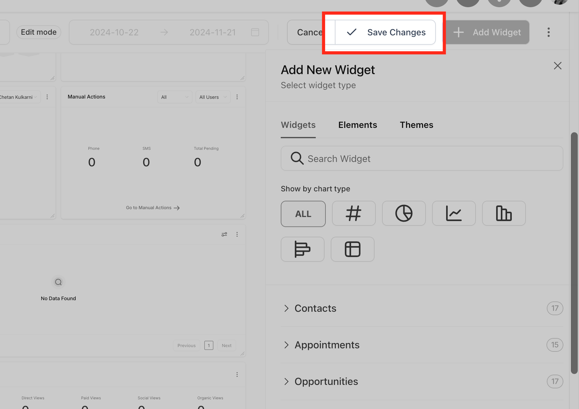
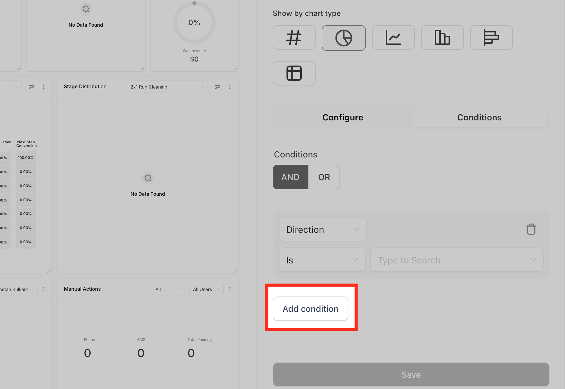
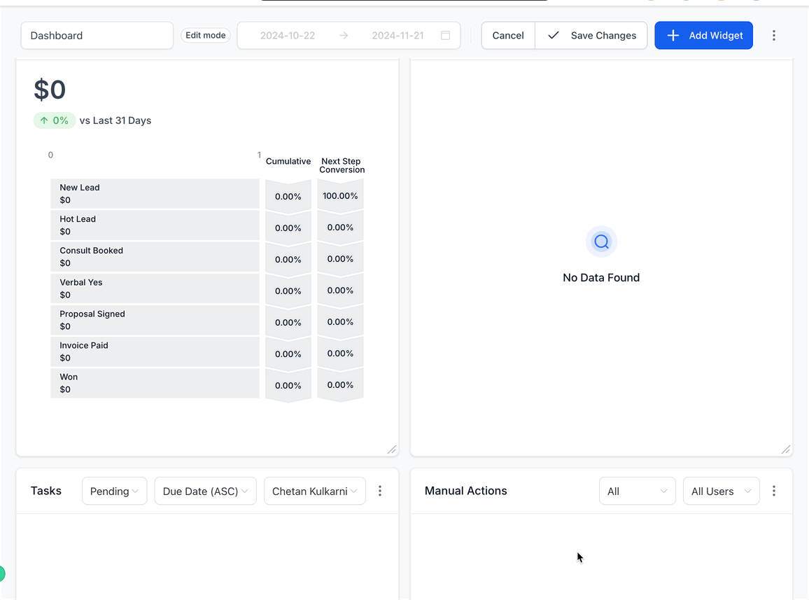
Select the widget you want to modify from the widget list. By default, each widget comes with a pre-selected chart type under the “ALL” filter. To change the chart type, click on the chart icon and choose the one that best fits your data.
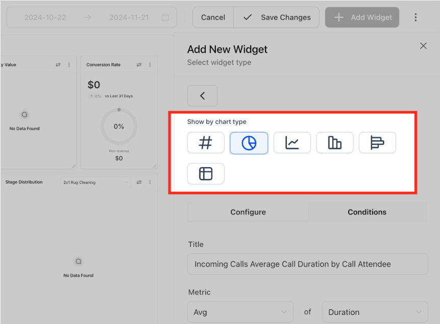
Go to the “Configure” tab to adjust the widget:
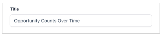
Title: Rename the widget to make its purpose clear.
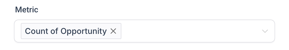
Metrics: Update the data points displayed in the widget. Multiple metrics can be added for Line, Bar and Horizontal bar charts.
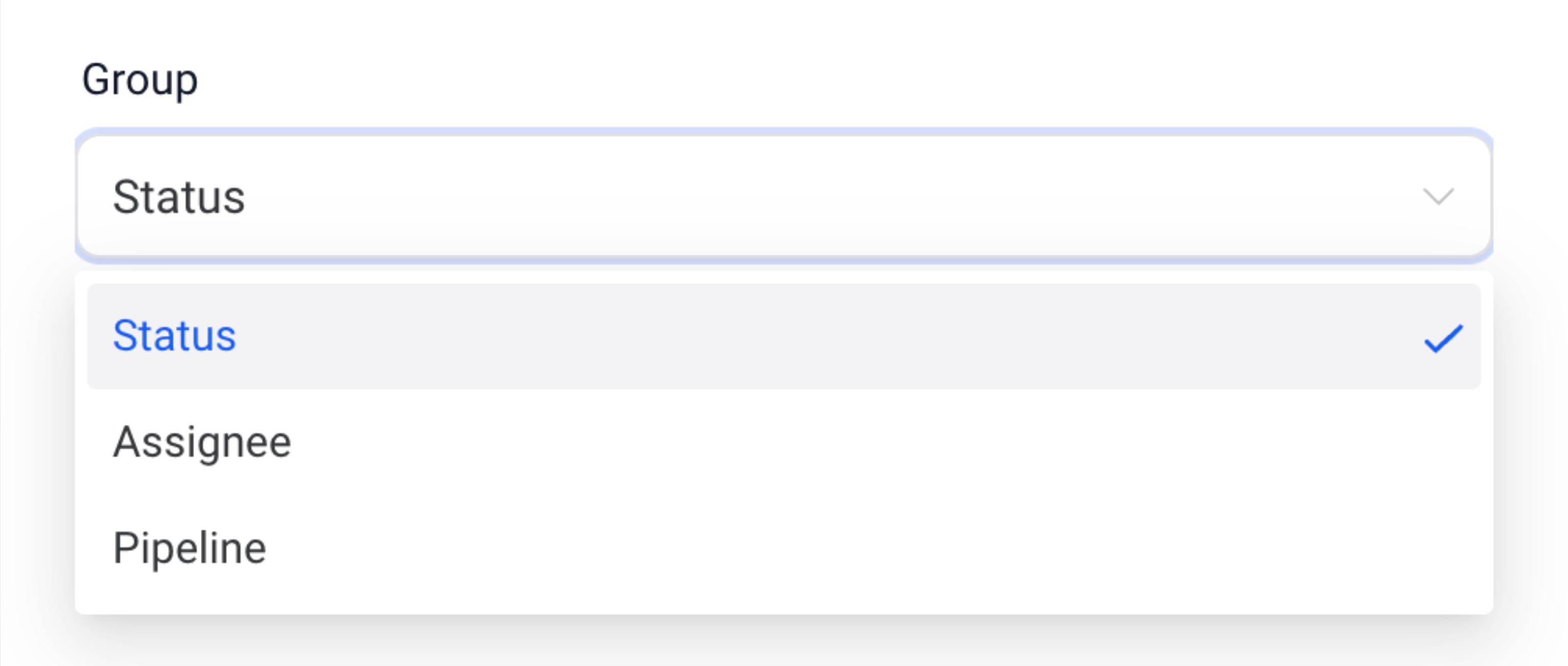
Group: Define grouping options for charts like Donut charts.
View By: Select the secondary dimension for visualizations like line or bar charts.
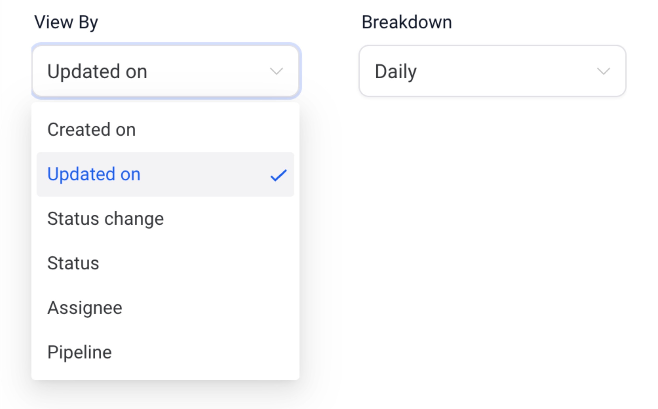
Breakdown: Adjust the time period frequency.
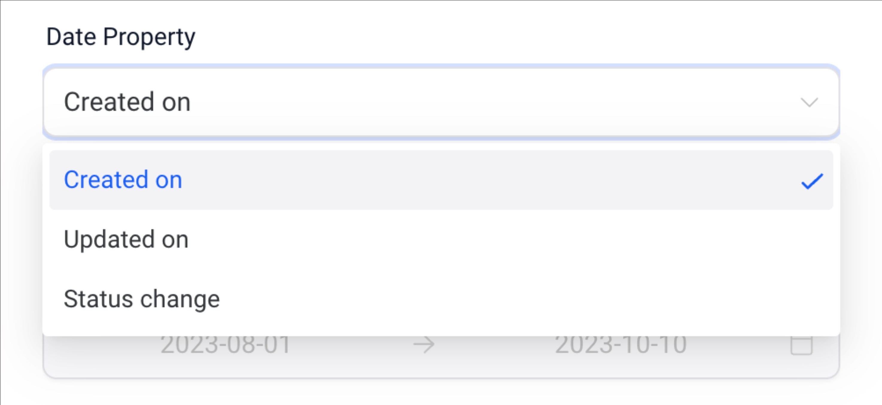
Date Property: Choose the date type (e.g., Created Date, Updated Date) for fetching results.
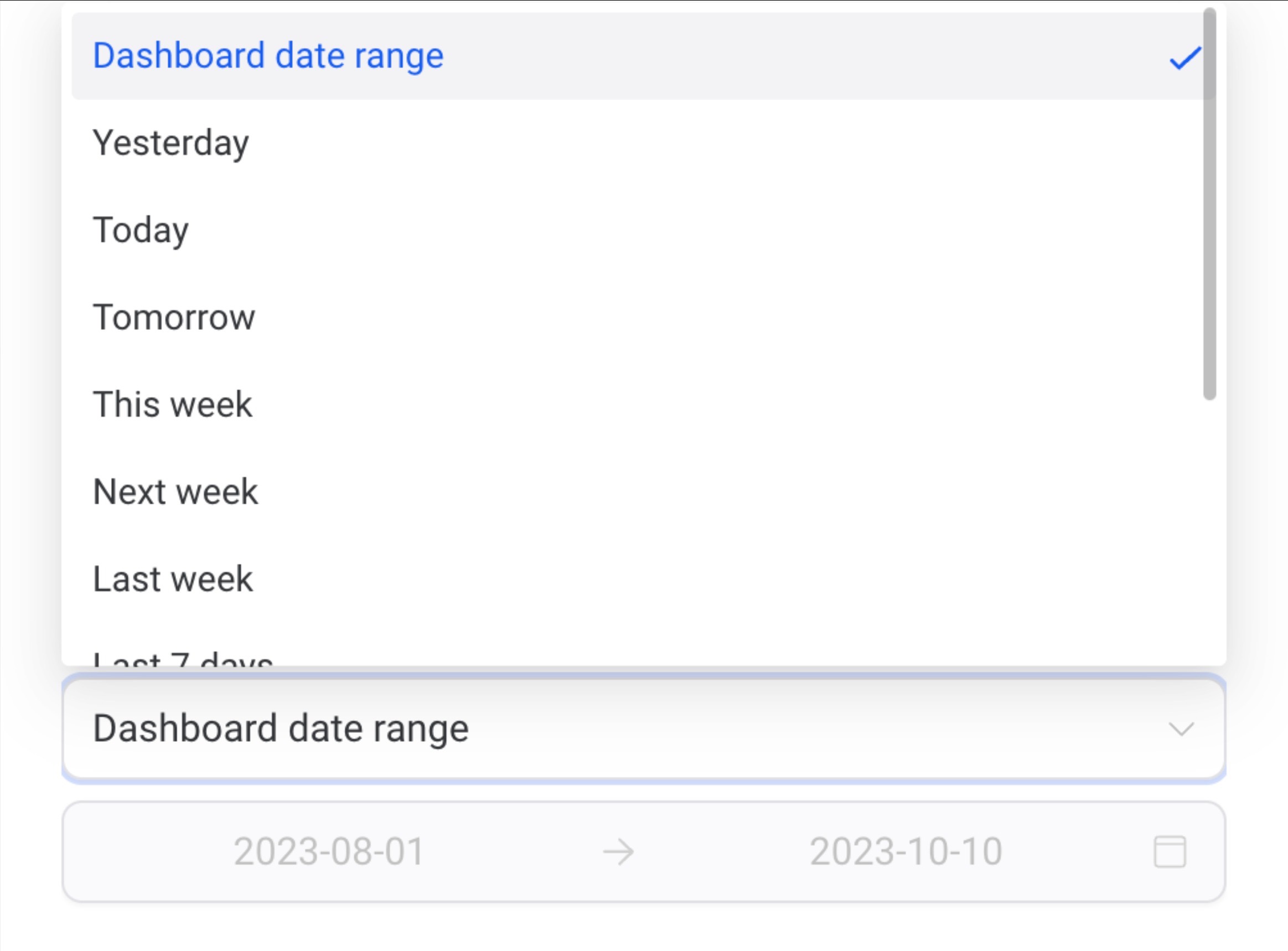
Date Range Override: Override the dashboard’s global date range for this widget.
Order: Sort the results in ascending or descending order.
Limit: Set a maximum number of results displayed.
Comparison Date Property: Add a comparison percentage for better context.
Advanced settings are available for further personalization, but they’re optional.
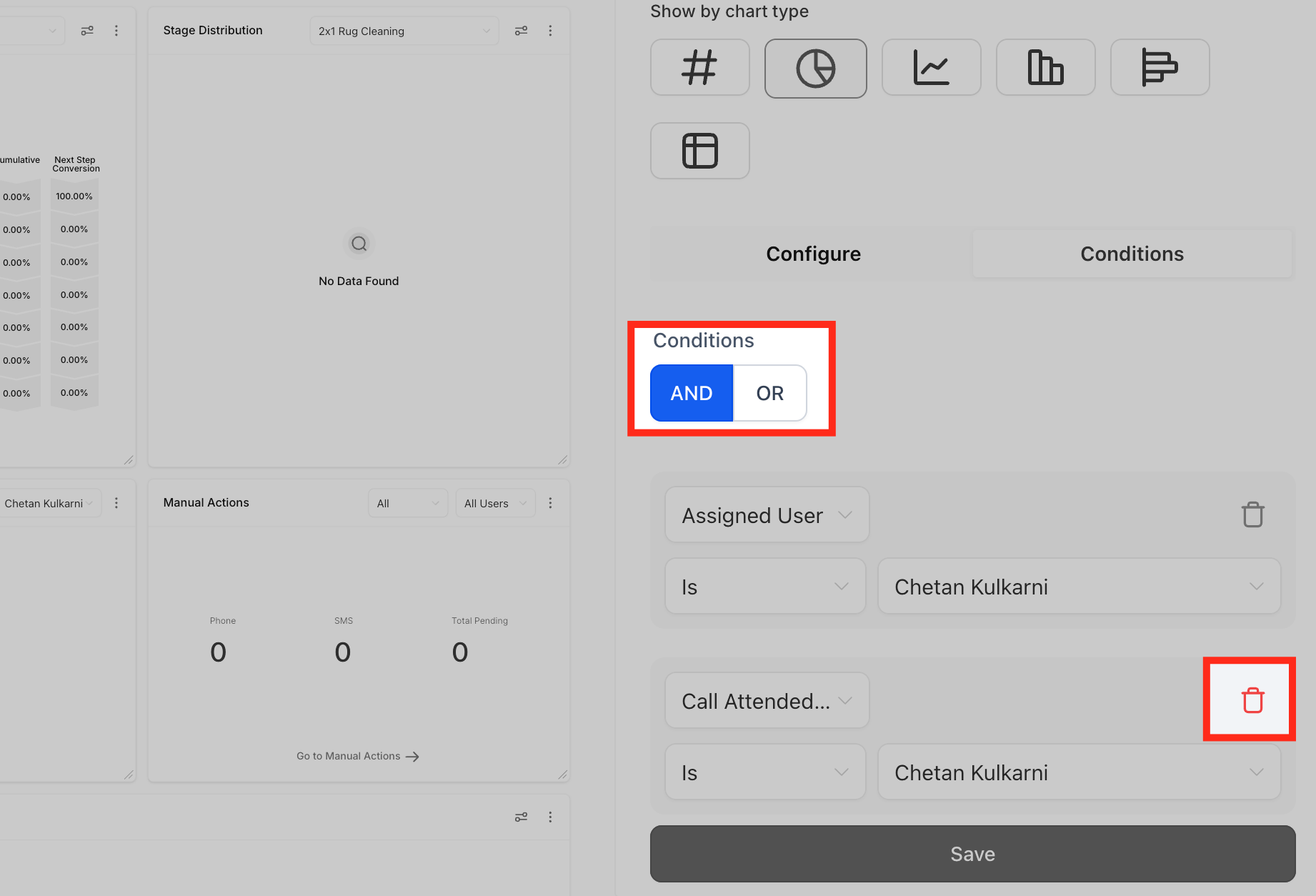
Filters help you focus on specific data. Here’s how to add them:
1. Click Add Condition under the “Conditions” tab.
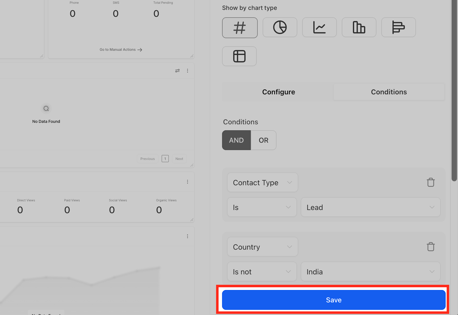
2. Choose the filter, operator, and parameters.
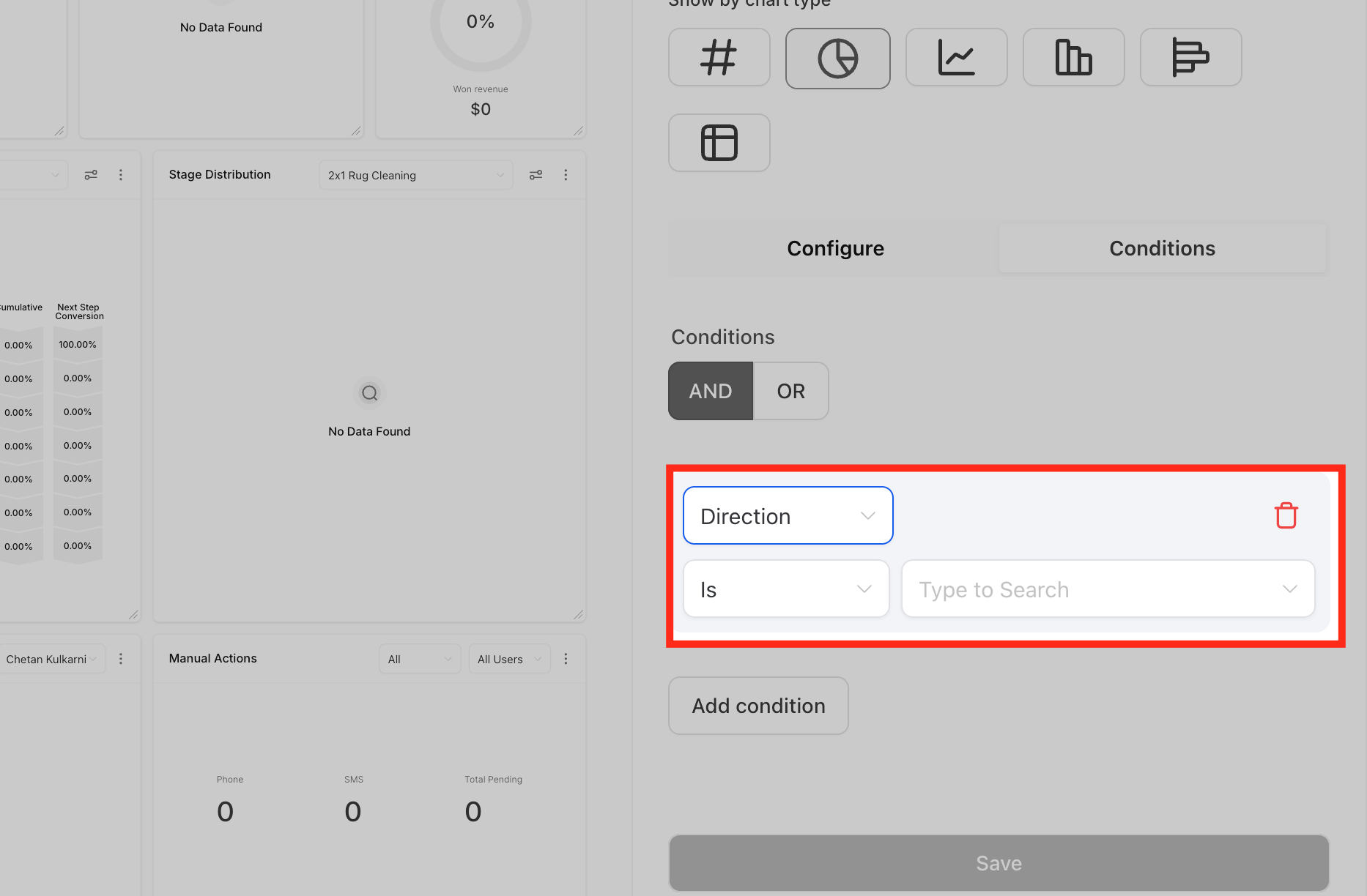
3. Add multiple filters using AND/OR conditions or delete any unnecessary ones.
Note: If no data matches a filter, the widget cannot be saved unless the filter is adjusted or removed.
Once all changes are made.
1. Click Save to update the widget.
2. Adjust the widget’s size or position on the dashboard if needed.
3. Save your dashboard layout to finalize the changes.